#Ad – this post contains an advertisement.
Great movie posters are an art form in themselves. Sometimes, they’re more iconic than the films they represent. I remember when I was a kid, in the late 80s/early 90s, we would walk to the local video shop to rent movies, there was only one copy of each movie. There was a Blockbuster in my home town but it was so far away from us it was easier just to visit the small video shop at the top of my estate. Blockbuster we saved for a special occasion, or if we wanted to rent a game.
I remember the video shop well, our membership number was 88. It had a small shop attached to it where you could buy sweets and America style products like Pez. And every square inch of the walls was covered in the latest movie posters. Every so often, the man who owned the shop would sell or give away some of his posters. I lived for those days. I’d head up with my pocket money I’d saved. The walls of my room soon filled up with anything that involved Corey Haim (that tells you how old I am) and later, Keanu Reeves. I had the same Point Break poster on my bedroom wall for far longer than was appropriate for a grown woman.
The movie poster is thought to have has its origins in France when Jules Cheret, an artist and later lithographer, developed a way to reproduce intense colour during the printing process. Pretty soon, the Bohemian streets of Paris were awash with posters advertising anything you could think of.
Film historians generally agree that the first-ever movie poster, designed to promote an individual film, was for L’Arrosuer Arrose, made in 1895.
Since then, the popularity of movies and the advancement of printing press technologies have seen the movie poster take on an iconic status. Computers and the advances in photography and graphic design. All movie fans will have their favourites. In 2018, Empire ran a poll to find the best movie posters of all time and the top 5 were
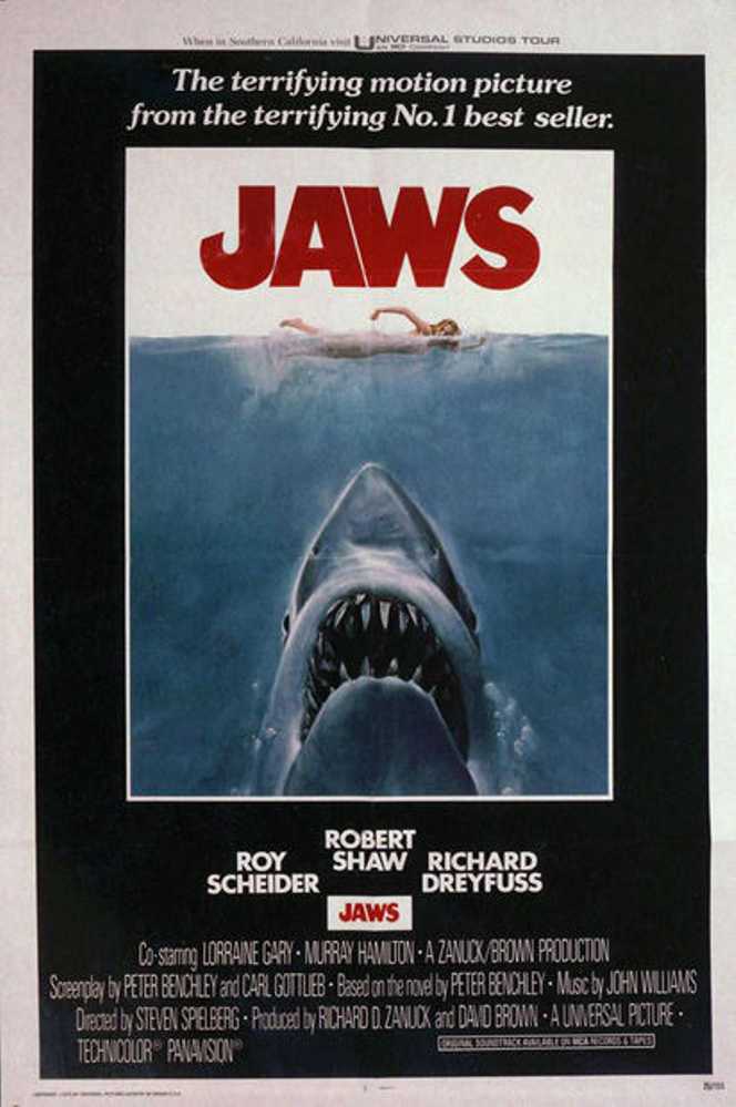
- Jaws
- Raiders of the Lost Ark
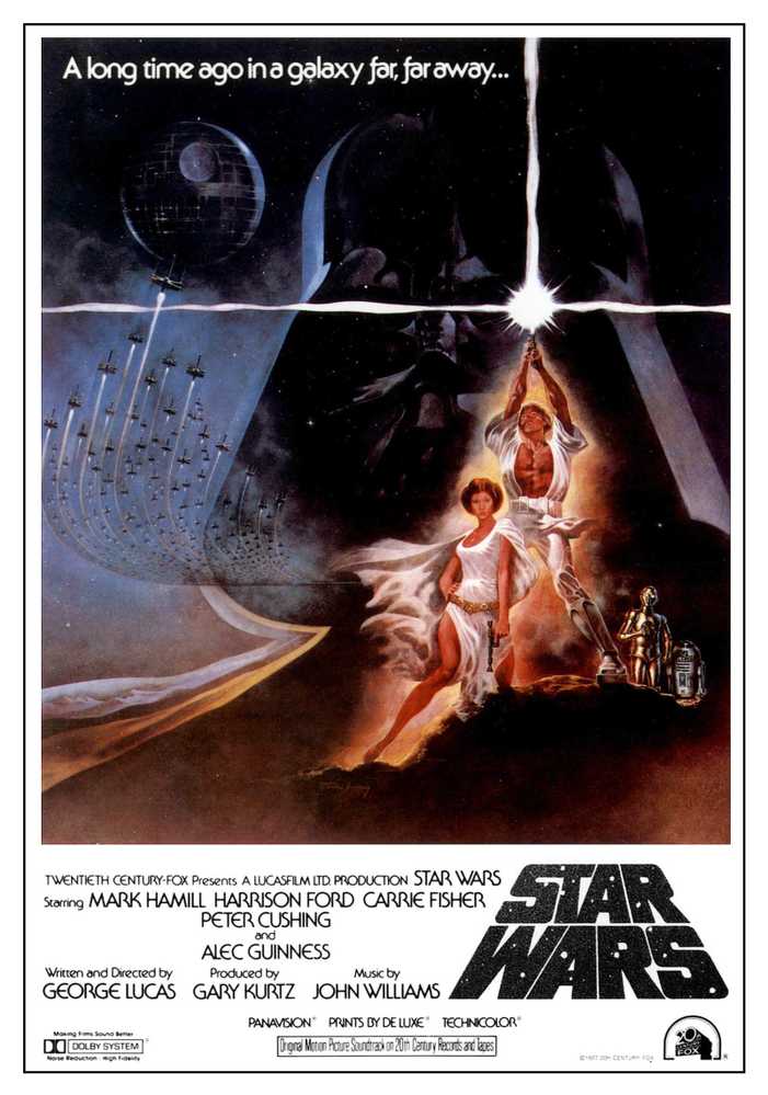
- Star Wars
- E.T.
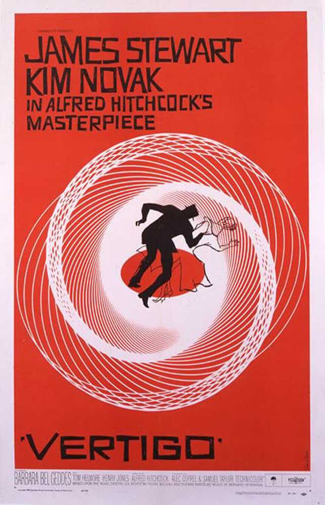
- Vertigo
What do these posters have in common? The fonts they use are all so unique, so attached to that film that it doesn’t matter what the word says, you recognise the font. The connection is so strong that some movie studios even copyright some of their fonts.
The movie poster is such an iconic piece of movie marketing, people love to recreate them for their own creative projects. There are many freebie fonts and stock imagery that you can use to help you with your project.
The movie poster is such an iconic piece of movie marketing, people love to recreate them for their own creative projects. There are many freebie fonts and stock imagery that you can use to
Jaws

The movie that put Steven Spielberg on the map. Widely considered to be the first summer blockbuster movie. The simple image of the huge shark, rising up beneath the unsuspecting swimmer with rows of jagged teeth. It’s a masterfully simplistic piece of marketing.
The iconic Jaws font was hand-drawn back in the 70s but is loosely based on the font Cosmos Extra Bold. The font Amity Jack is based on the hand-drawn original artwork.
Raiders of the Lost Ark

Indiana Jones is one of the most popular movie characters of all time. Harrison Ford played the archaeologist come adventurer in two fantastic movies (and two not so fantastic). The poster was created by the legend that is Richard Amsel, the talent behind the artwork of Flash Gordon, The Dark Crystal, The Sting and Chinatown. The font for raiders was created especially for the movie, but if you’re looking to recreate the typography, you’ll need a font called Fedora (what else).
Star Wars

Over nine movies and a handful of spin-offs, the Star Wars font has undergone some imperceptible tweaking over the decades.
There are three fonts that represent the Star Wars universe. The opening screen, ‘A long time ago, in a galaxy far, far away,’ was based on a hand-drawn screen right up until Disney bought the franchise. They are now digitised. The opening crawl on the new movies is in News Gothic.
The Star Wars fan base is always alert to any change in look and feel, with whole Subreddit’s related to the subject.
E.T. The Extra-Terrestrial

One of the favourite childhood films of Gen X. Steven Spielberg makes another appearance in the top five. The original poster is loosely based on the Michaelangelo’s Sistine Chapel, with E.T. and Elliot reaching out towards each other. It was later replaced with the movie image of Elliot’s bike crossing in front of the moon. The font used is ITC Souvenir Medium.
Vertigo

The instantly recognisable work of Saul Bass is never better than for Hitchcock’s Vertigo. Again, the iconic font was hand-drawn especially for the movie, but the Sabotage font is a close match as you will find if you’re looking to create something based on the Saul Bass look.
Modern Day Movie Posters
As you might have noticed, all of these posters are from classic films rather than more modern ones. A lot of people have begun to notice how much movie posters are starting to look the same and are somewhat lacking in originality. Many of the recent Star Wars and MCU posters are pretty much interchangeable as they try and solve the problem of representing an ensemble cast on a single poster. What you’re left with is often formulaic.
The Future Of The Movie Poster
Far from being a casualty of the digital age, the movie poster still maintains an important part of the movie marketing buzz. The visuals are often the first element teased online, often appearing around the same time as the initial teaser trailers. While physical posters become less widespread (RIP Blockbuster) and instead are sold online to collectors and movie fans.
The digital element can allow for more options such as multiple versions or specialist character posters. Many cinemas are now dispensing with traditional poster space and using it for digitally enhanced posters and videos.
Though the movie poster is not the centrepiece it once was, it’s still a cherished part of the process for every true movie fan.


